The furthest seat
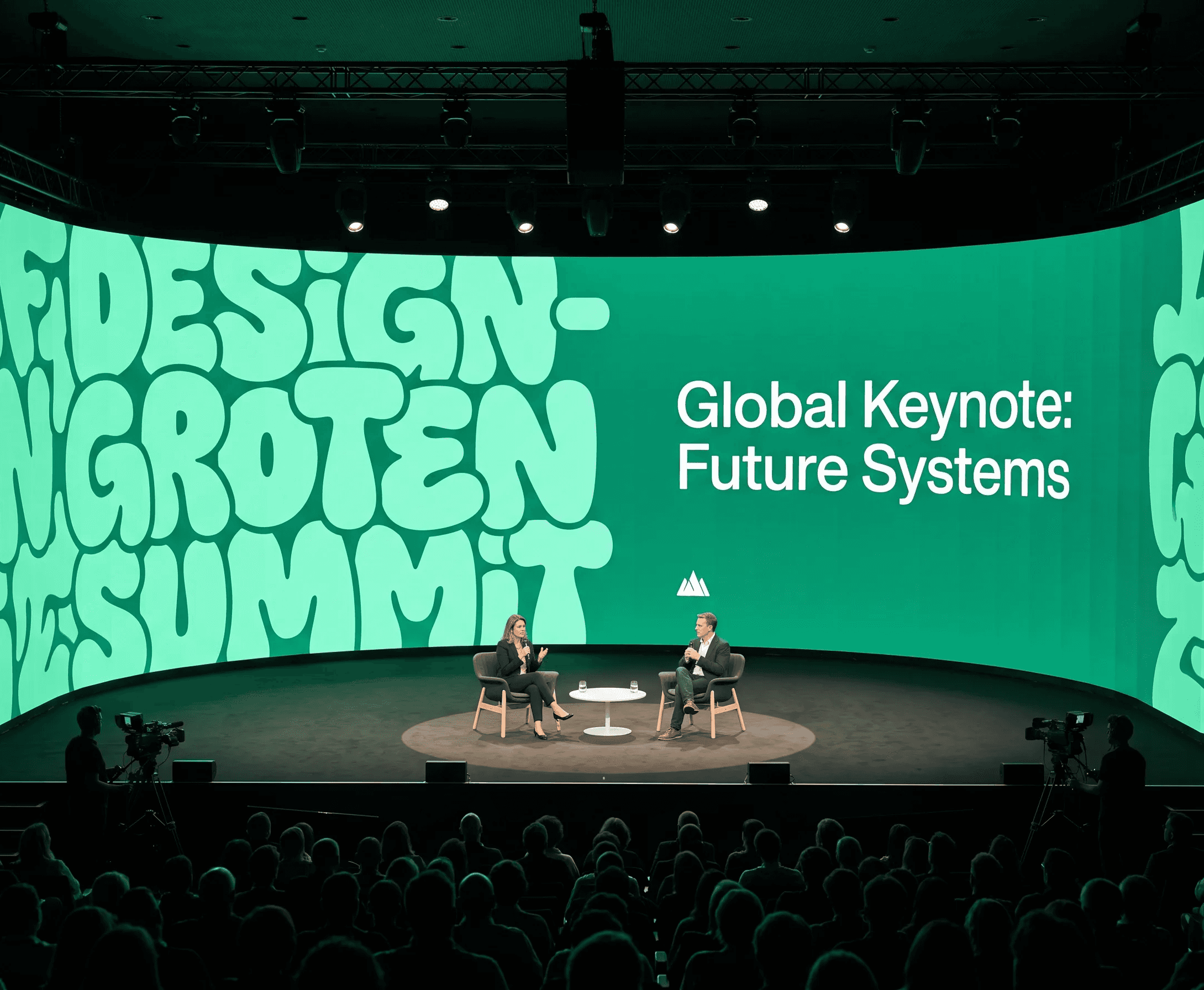
Every piece of environmental type has a back row. It is the seat furthest from the screen, the person walking past the window, the sign read from across a road. If the type fails there, it has failed for most of the people who will ever see it.
So we design the back row first, and work forward from it.
Choosing a typeface for distance
At ten metres, stroke contrast is the first thing to go. High-contrast faces turn into a grey smudge, and the details that make them elegant become noise. For distance work we look for even stroke weight, open counters, and a tall x-height.
It is a narrower set of options than it sounds, and most of them are not the faces a studio would reach for on a print campaign.
Hierarchy at scale
Scale changes hierarchy. A size difference that reads as clear on a page disappears on a wall, because the eye stops comparing two lines and starts reading them as one mass. Environmental type needs bigger jumps between levels than print does, often twice the ratio.
Testing in the room
We mock the type up at full size and then walk away from it. Standing at the actual distance, in the actual light, is the only honest test. A layout that looks balanced on a monitor frequently falls apart the moment it is on a wall with a window opposite it.
Conclusion
Designing for distance is mostly an exercise in giving things up. Fewer sizes, fewer weights, fewer words. What survives is the part that was doing the work all along.